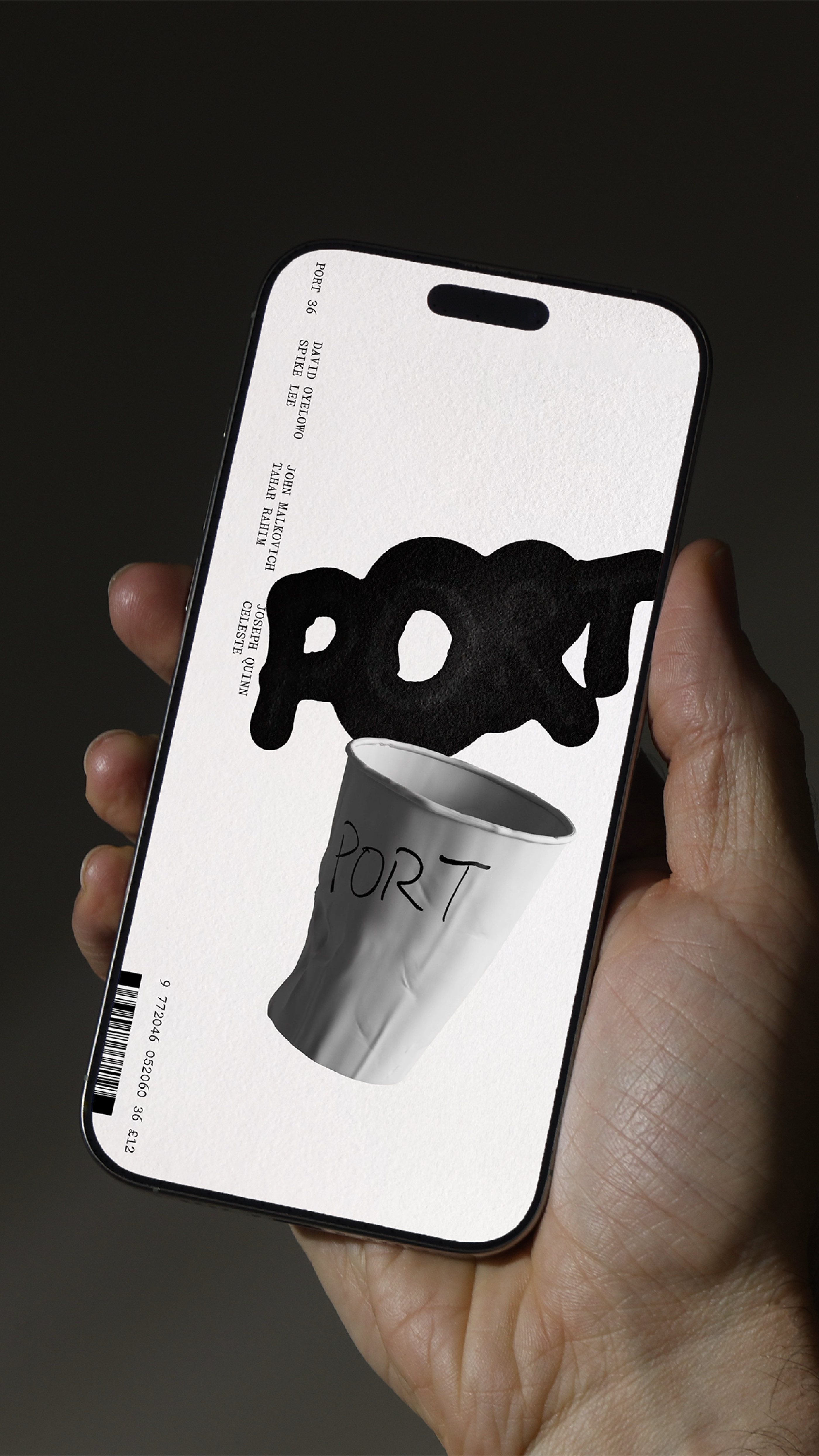
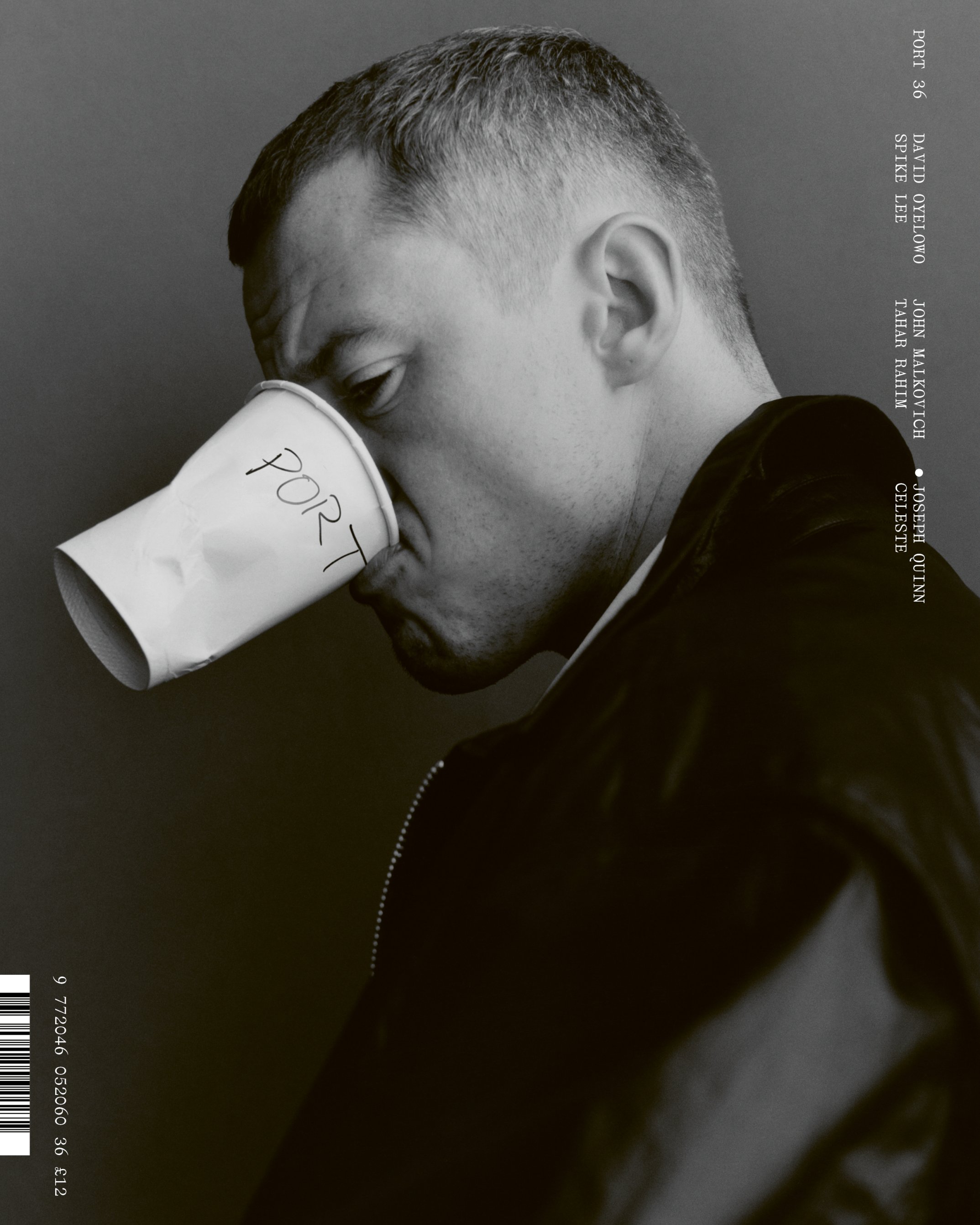
PORT Magazine: Written into Motion
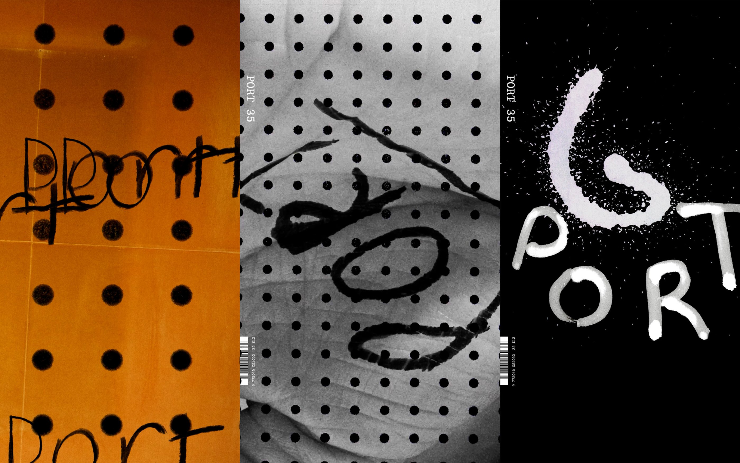
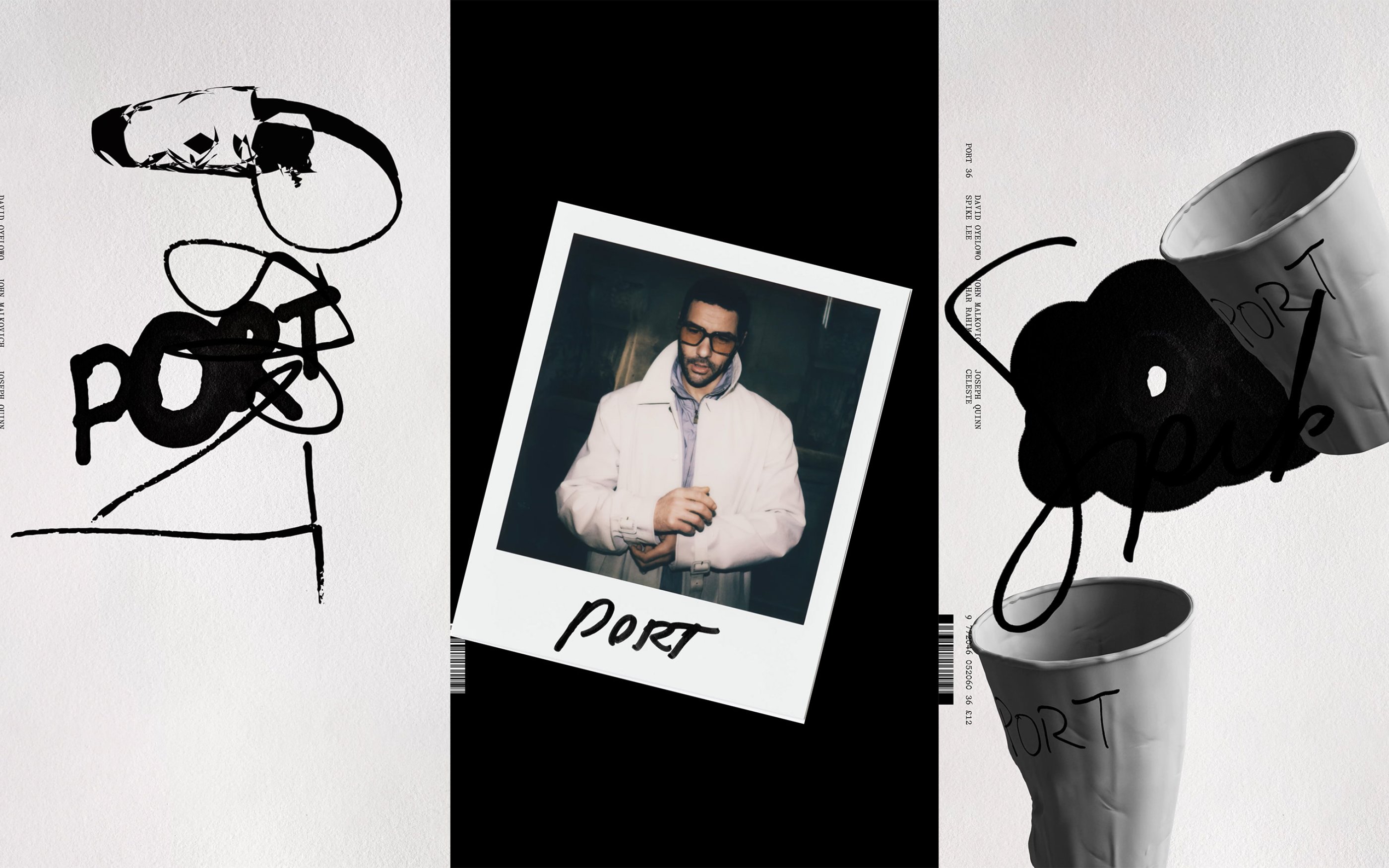
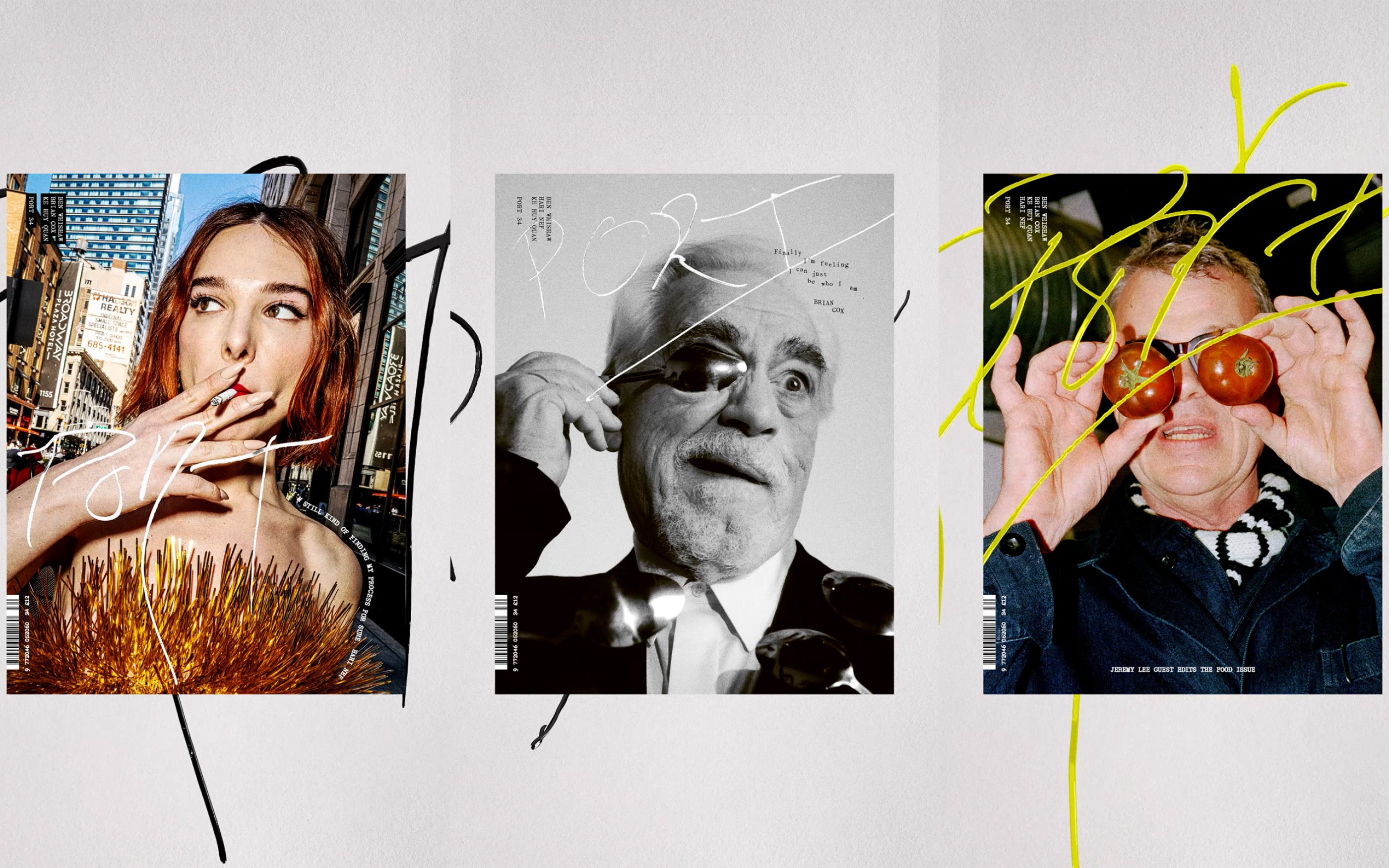
PORT Magazine is a biannual publication that has long treated their covers as cultural artefacts rather than a marketing surface. Since Creative Director Matt Curtis’ 2023 re-design each issue invites its cover star to contribute their own handwritten interpretation of the PORT masthead – a gesture that champions personality, authorship, and the intimacy of the human hand.
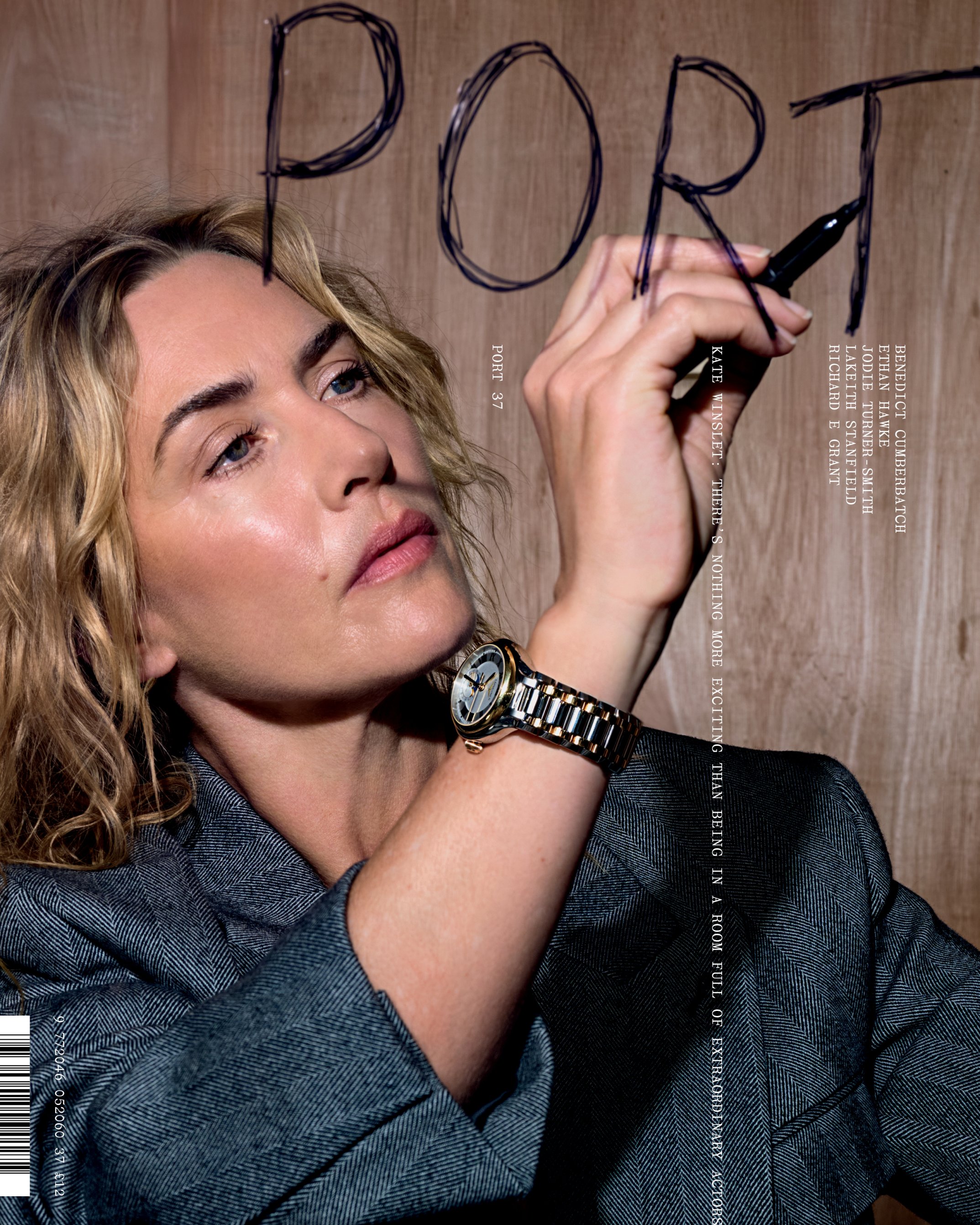
ACRE was commissioned to translate this concept into motion for the launch of every new issue since the redesign. Animating each cover’s handwritten mark in a way that preserves its individuality, rhythm, and imperfections, while allowing it to live fluidly across digital channels.
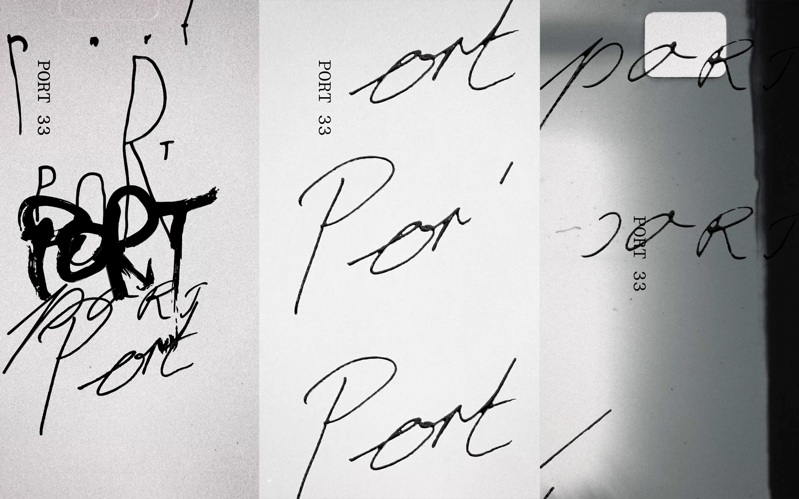
We’ve leaned into the innate intimacy of handwriting: pressure, pace, hesitations, and idiosyncrasies
We’ve leaned into the innate intimacy of handwriting: pressure, pace, hesitations, and idiosyncrasies – working out the subtle moments where a line wavers or accelerates becoming the emotional core of the movement. Rather than smoothing or standardising the forms, we see the handwriting as micro-performance: something temporal, expressive, and deeply personal.
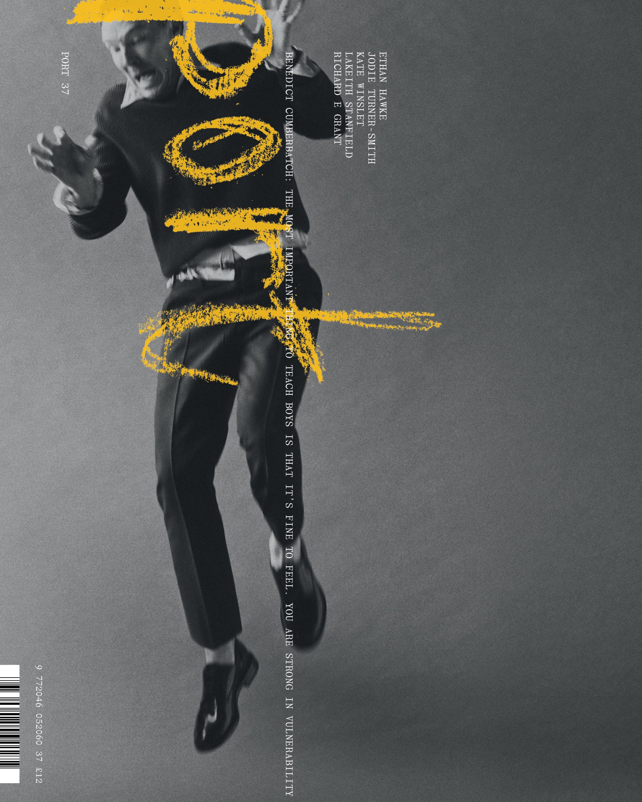
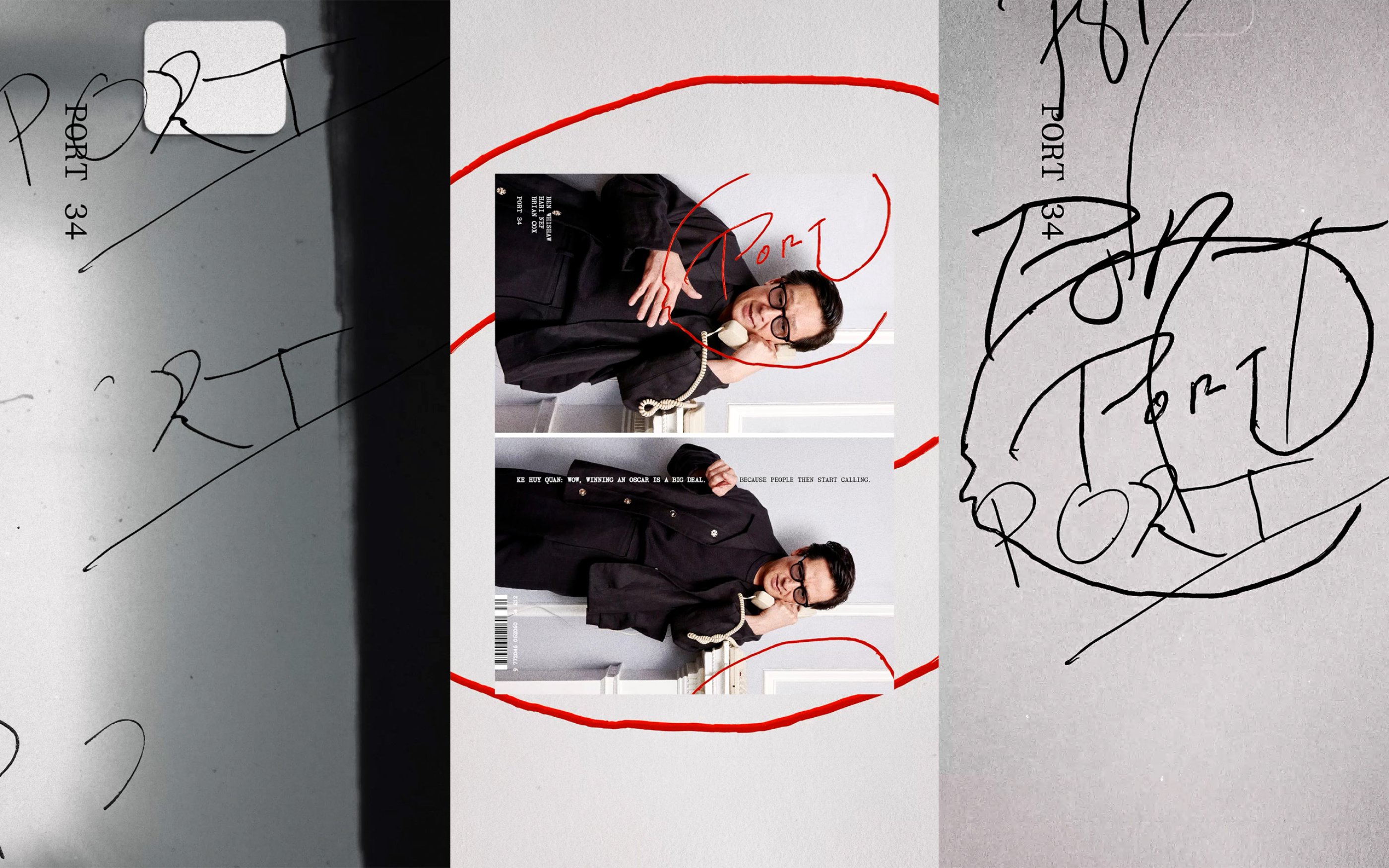
The resulting campaign sits somewhere between typography, portraiture, and signature – in motion, the masthead becomes less a logo and more a trace: a record of presence maybe, captured just long enough to be shared.
- Design TeamJonas Zieher, Oliver Häusle
- CollaboratorsMatt Curtis, Uncommon Creative Studio