Switch on: a new identity for raasch
Switch on: raasch
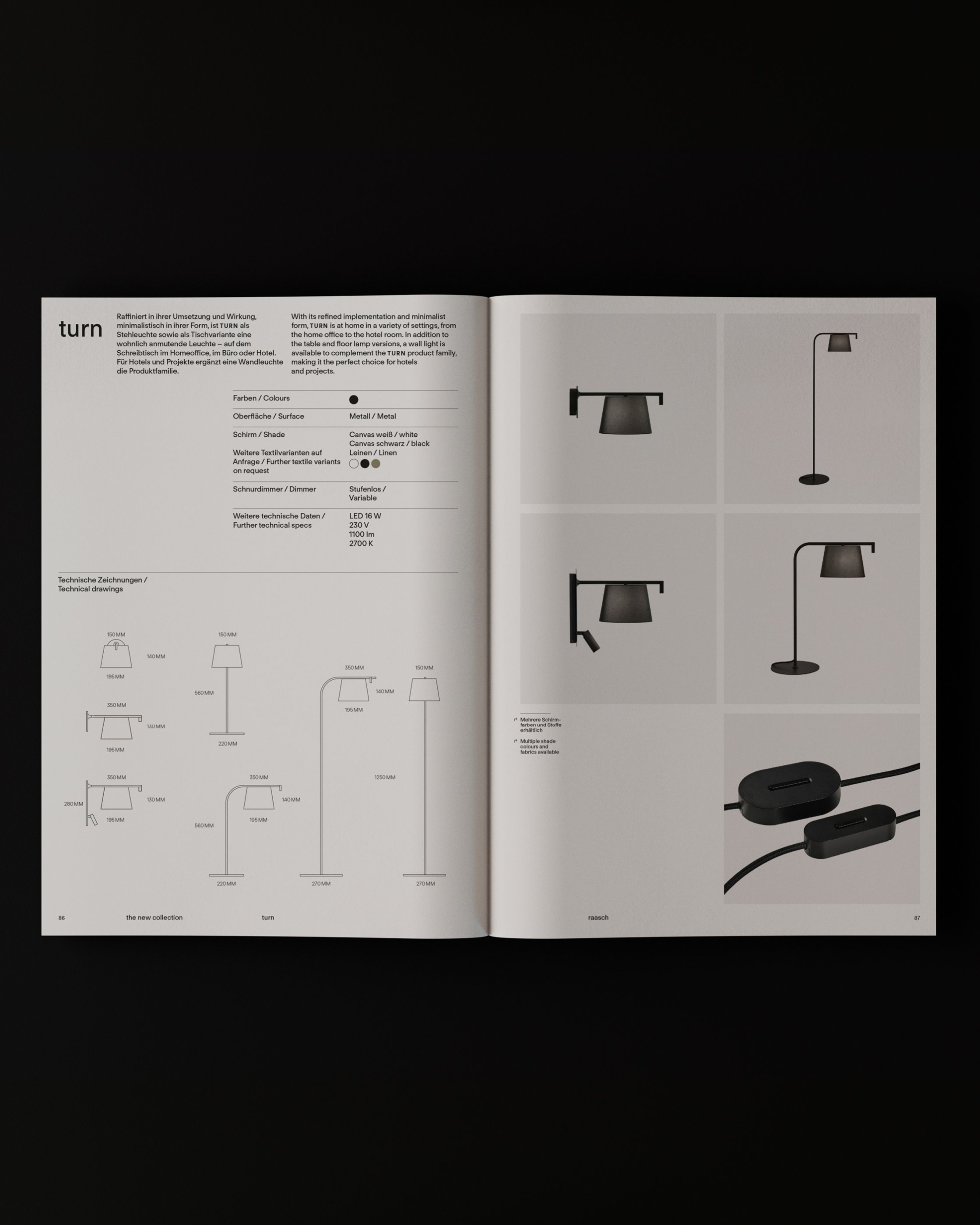
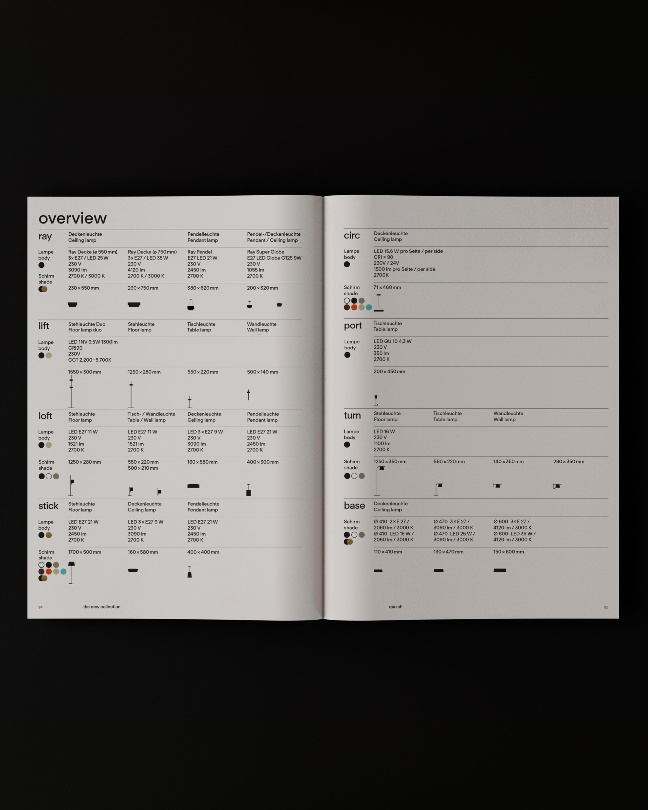
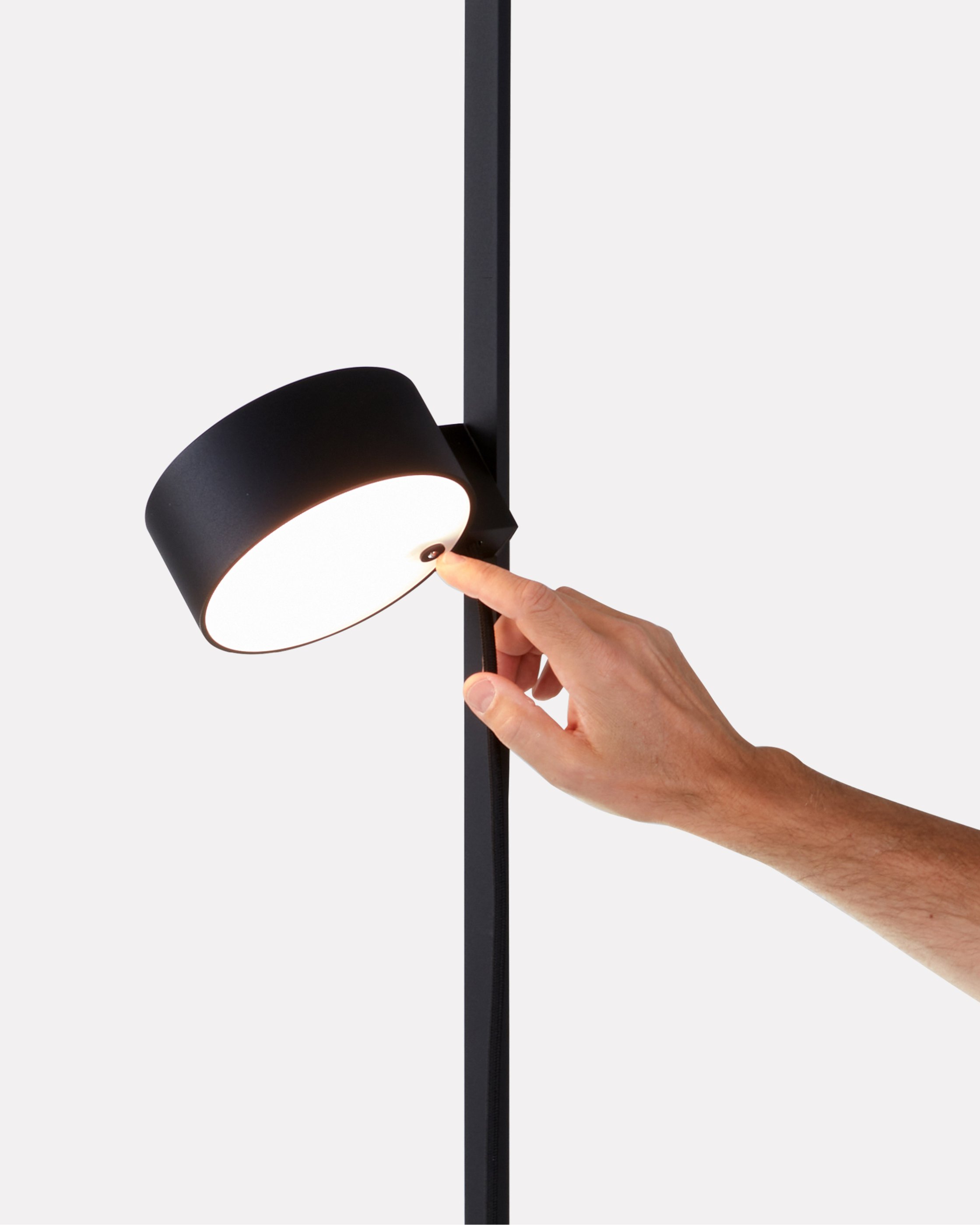
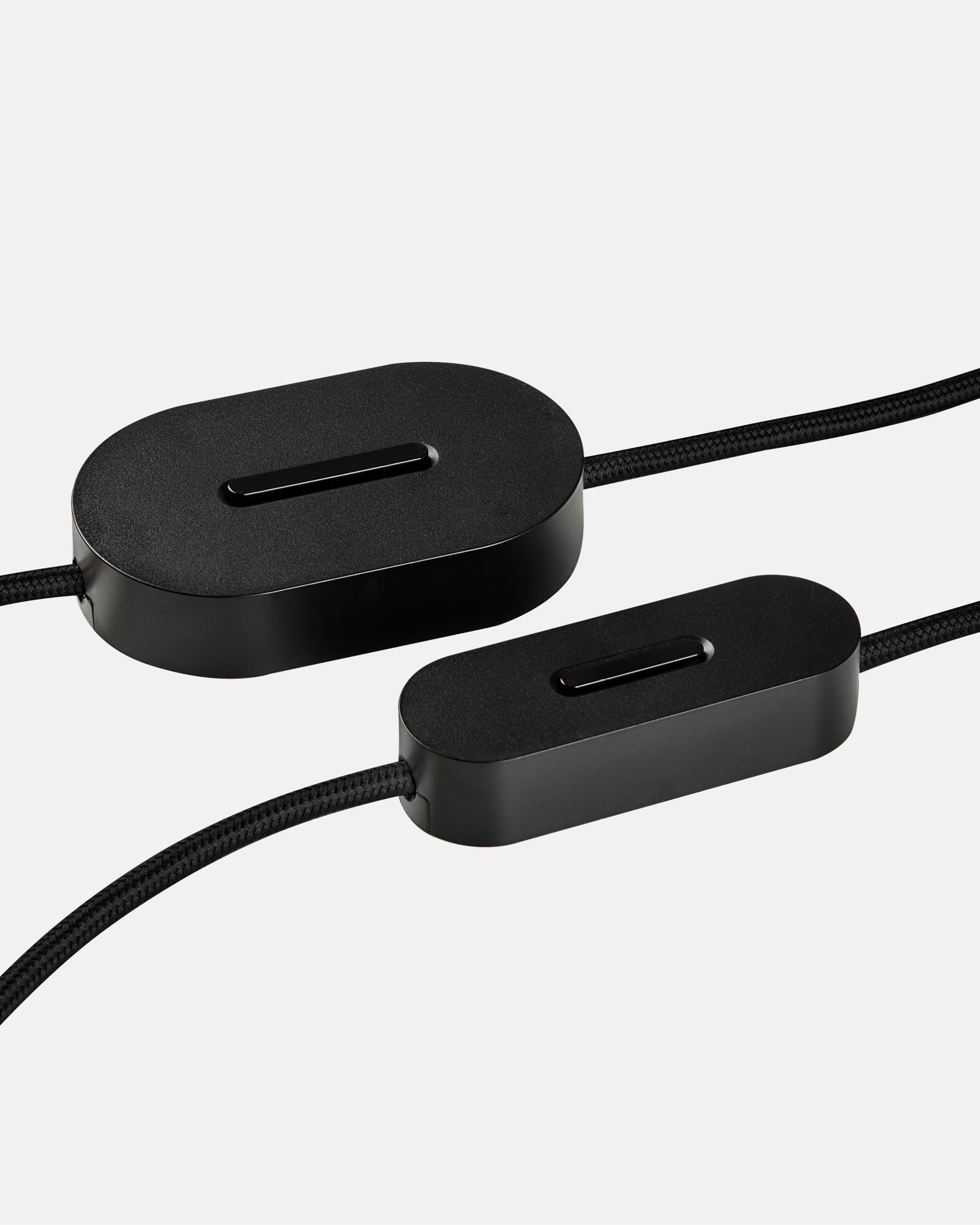
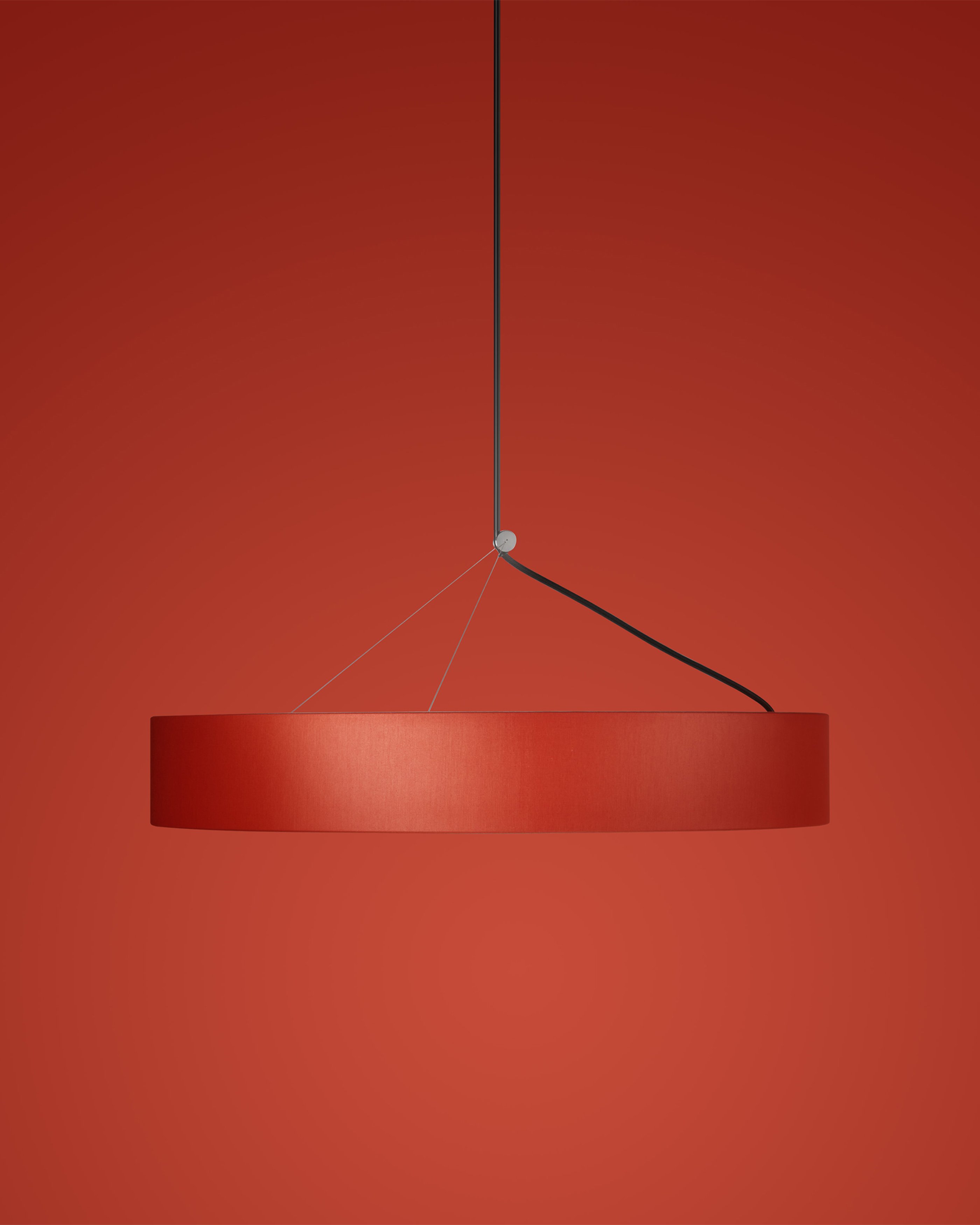
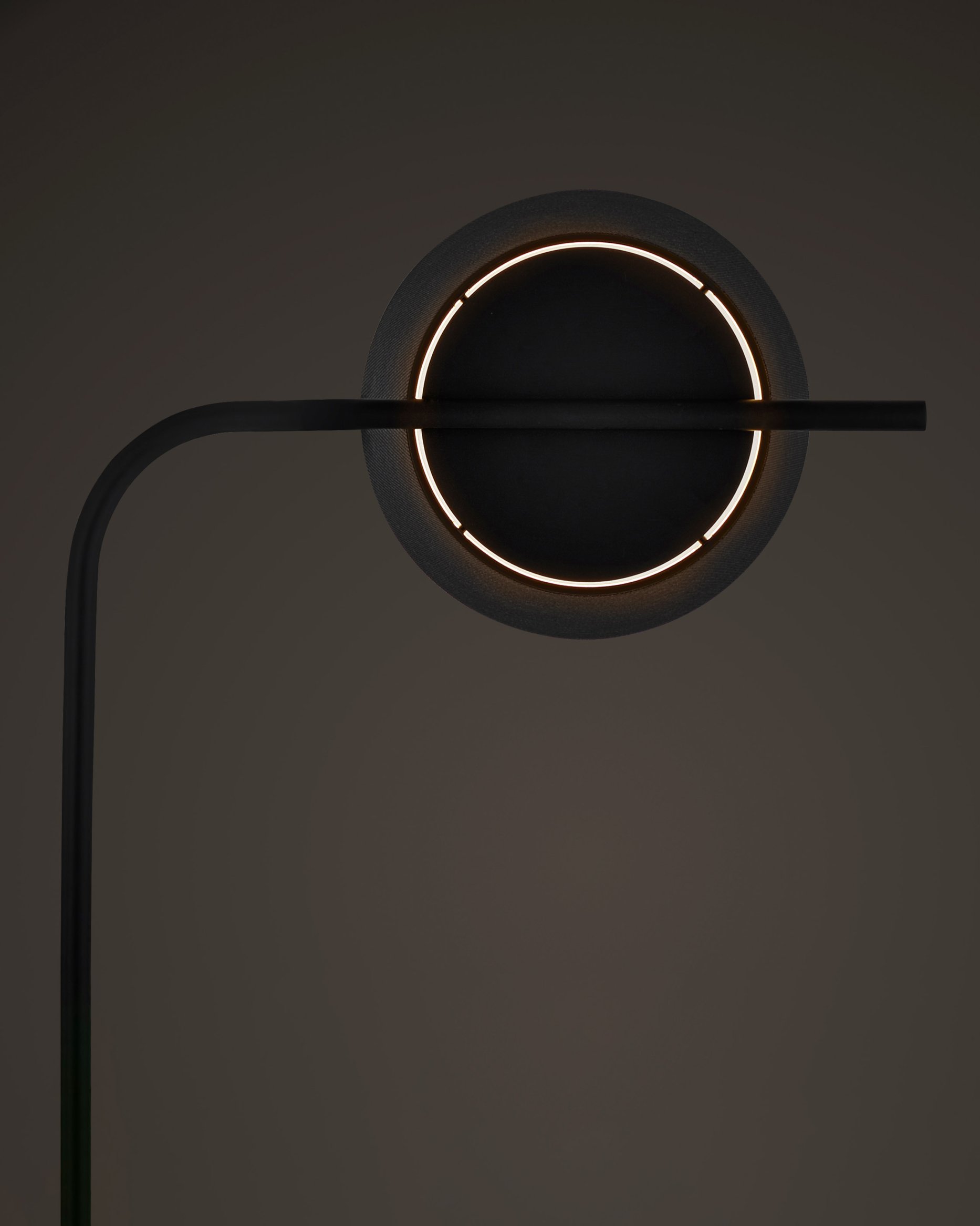
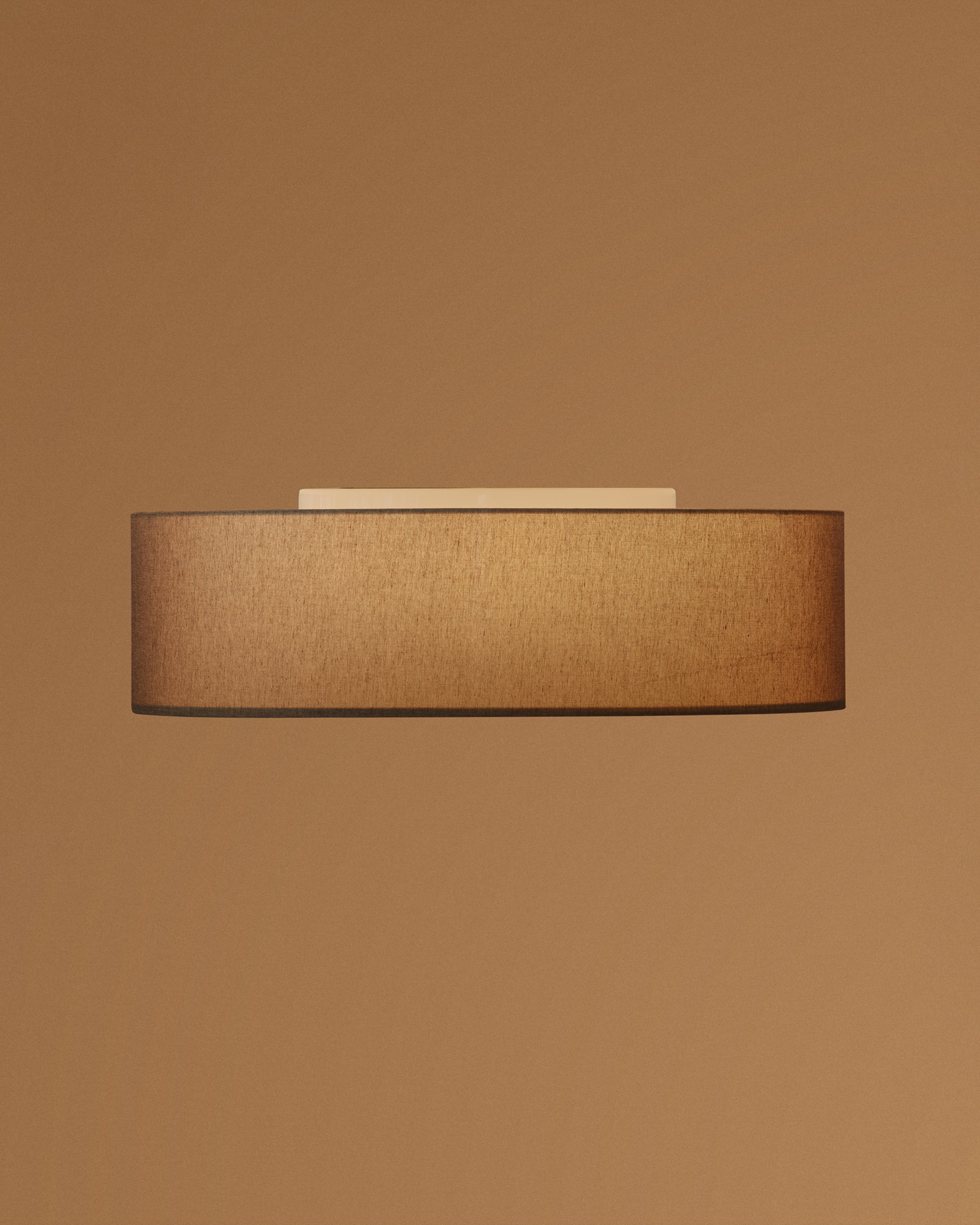
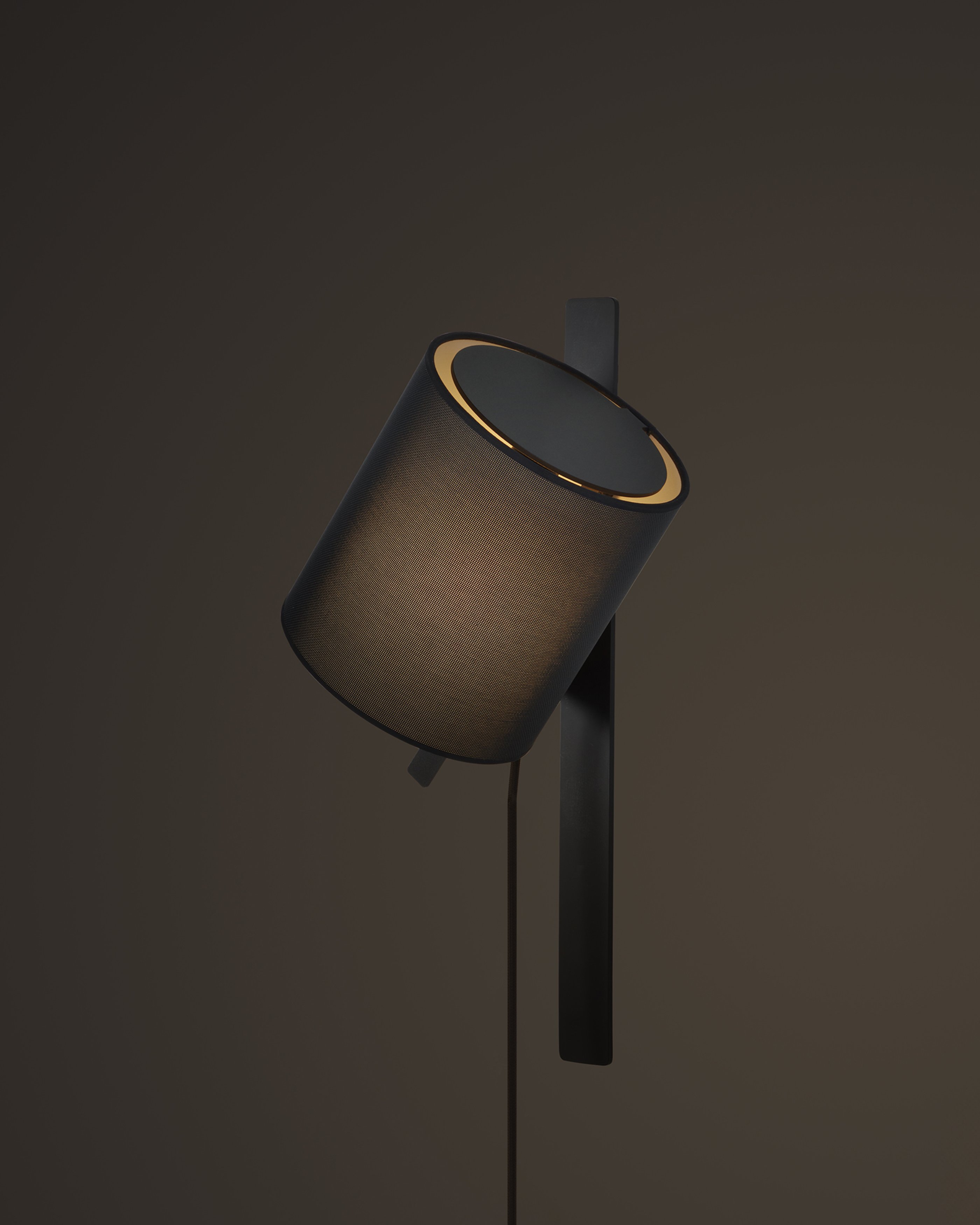
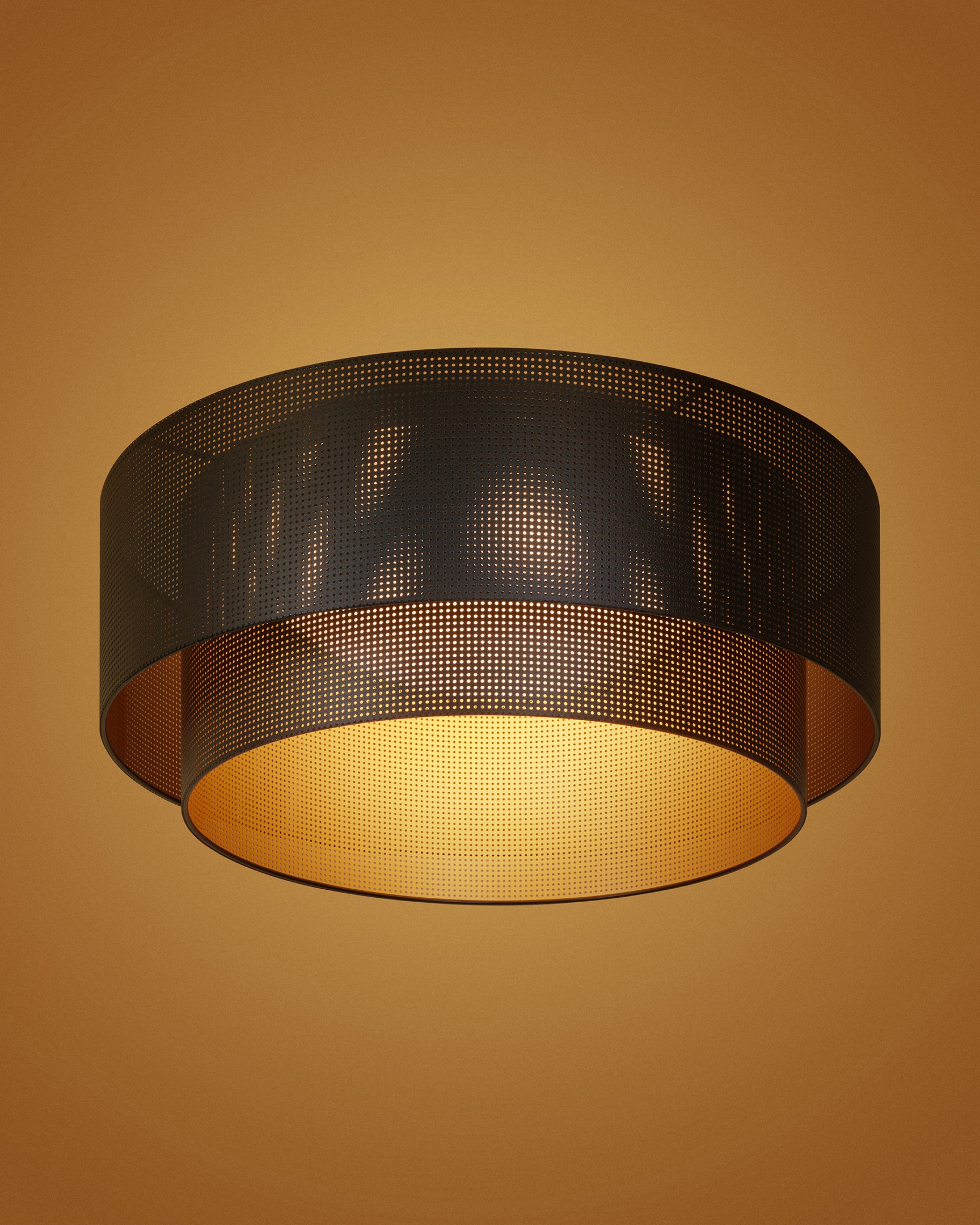
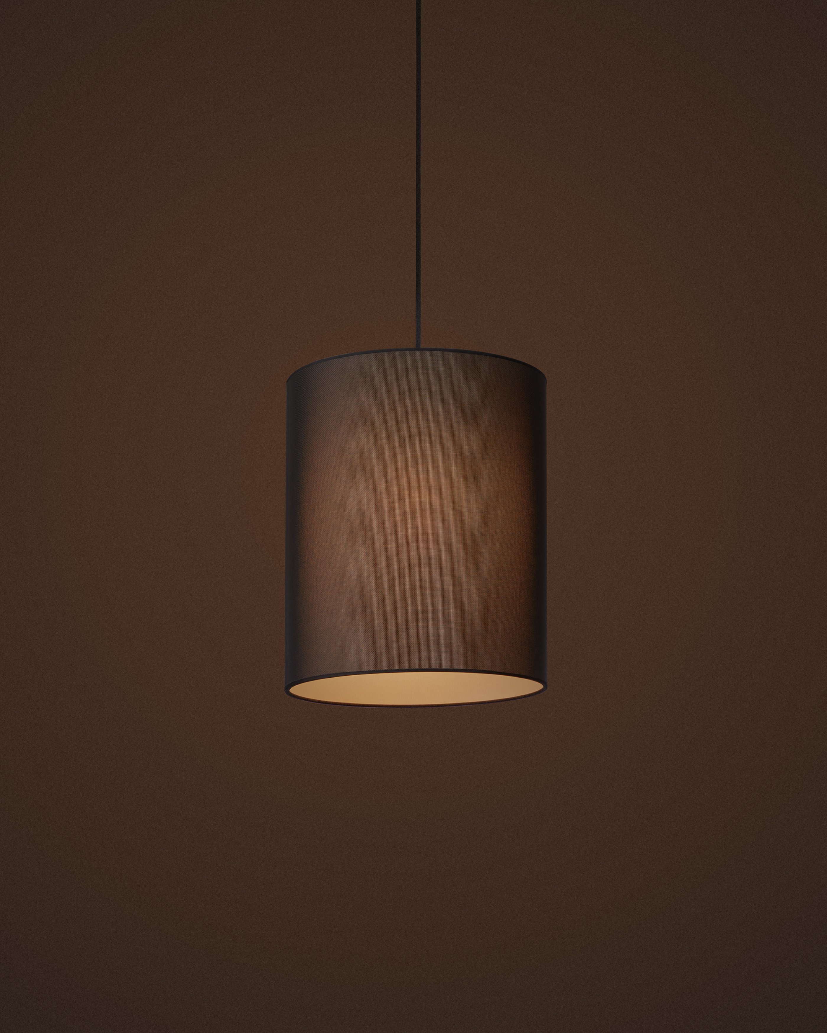
Driven by a perpetual search for the essential, German lighting brand raasch produces lamps that combine iconic silhouettes with clever detailing. Designed by renowned product designer Michael Raasch, the brand offers a refined collection of products that balance formal rigour with intuitive usability, engineered and produced to highest standards.


In a crowded category we’ve created a brand identity that highlights the products formal rigour, expressed across a refined geometric logotype and a bold graphic marque.
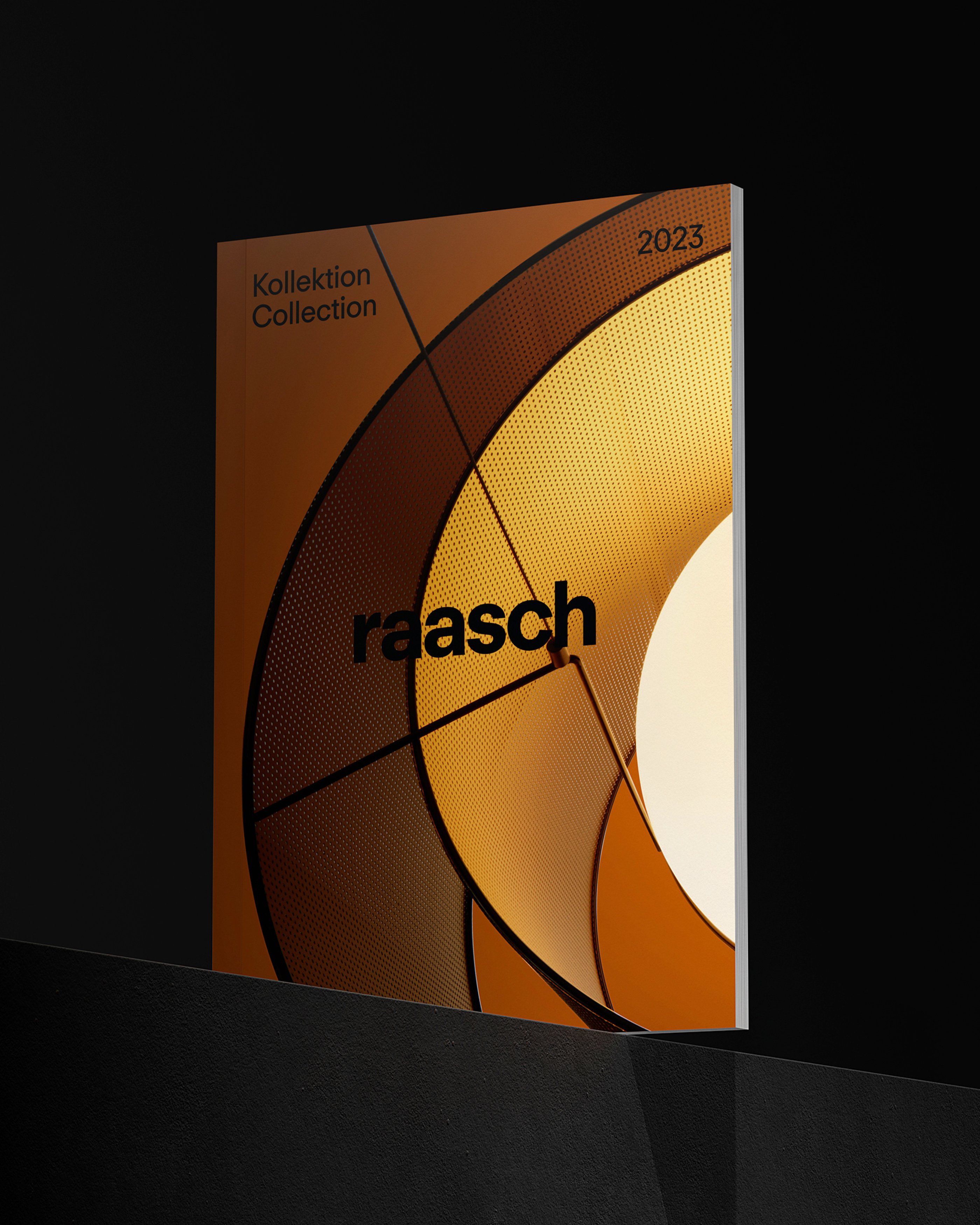
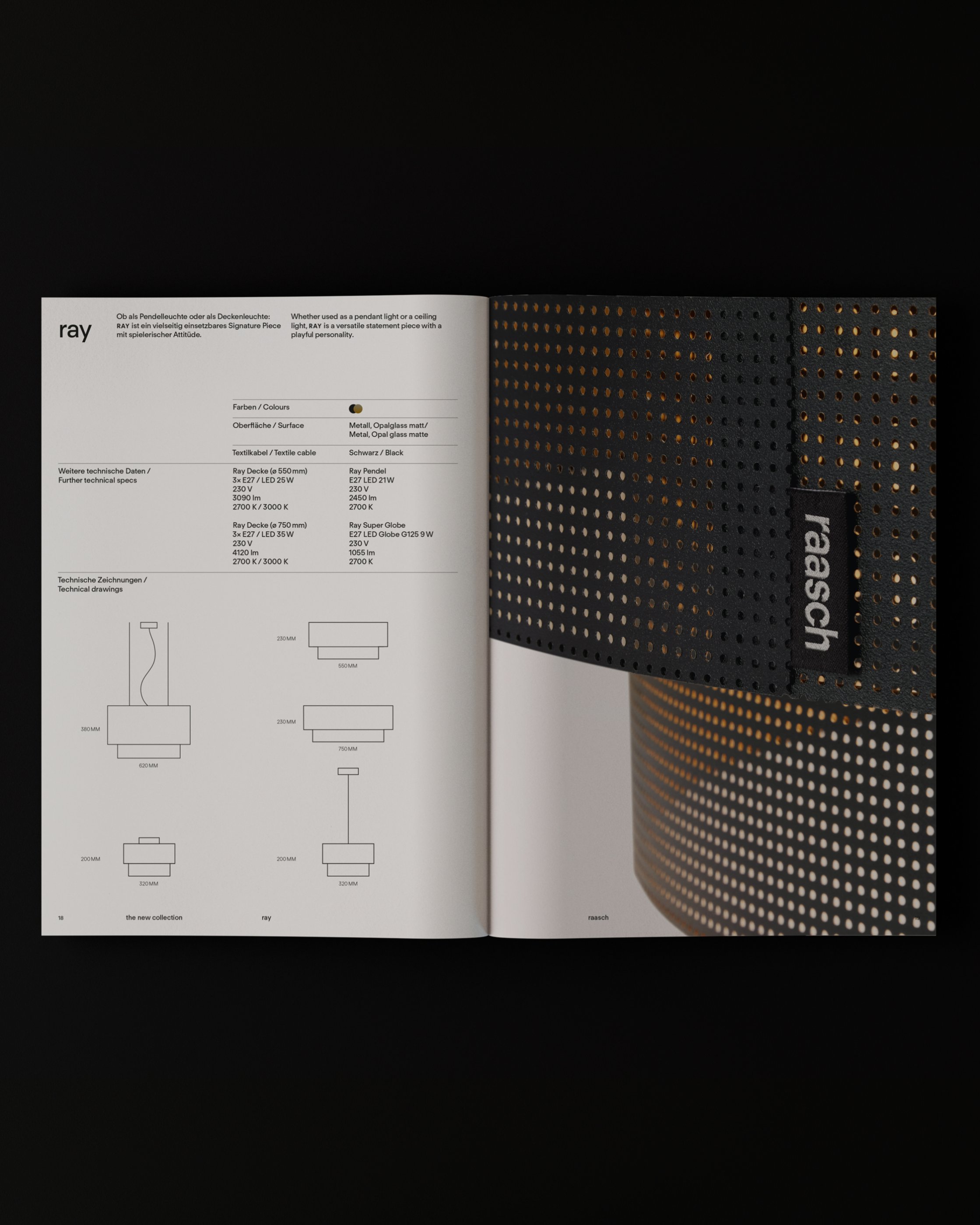
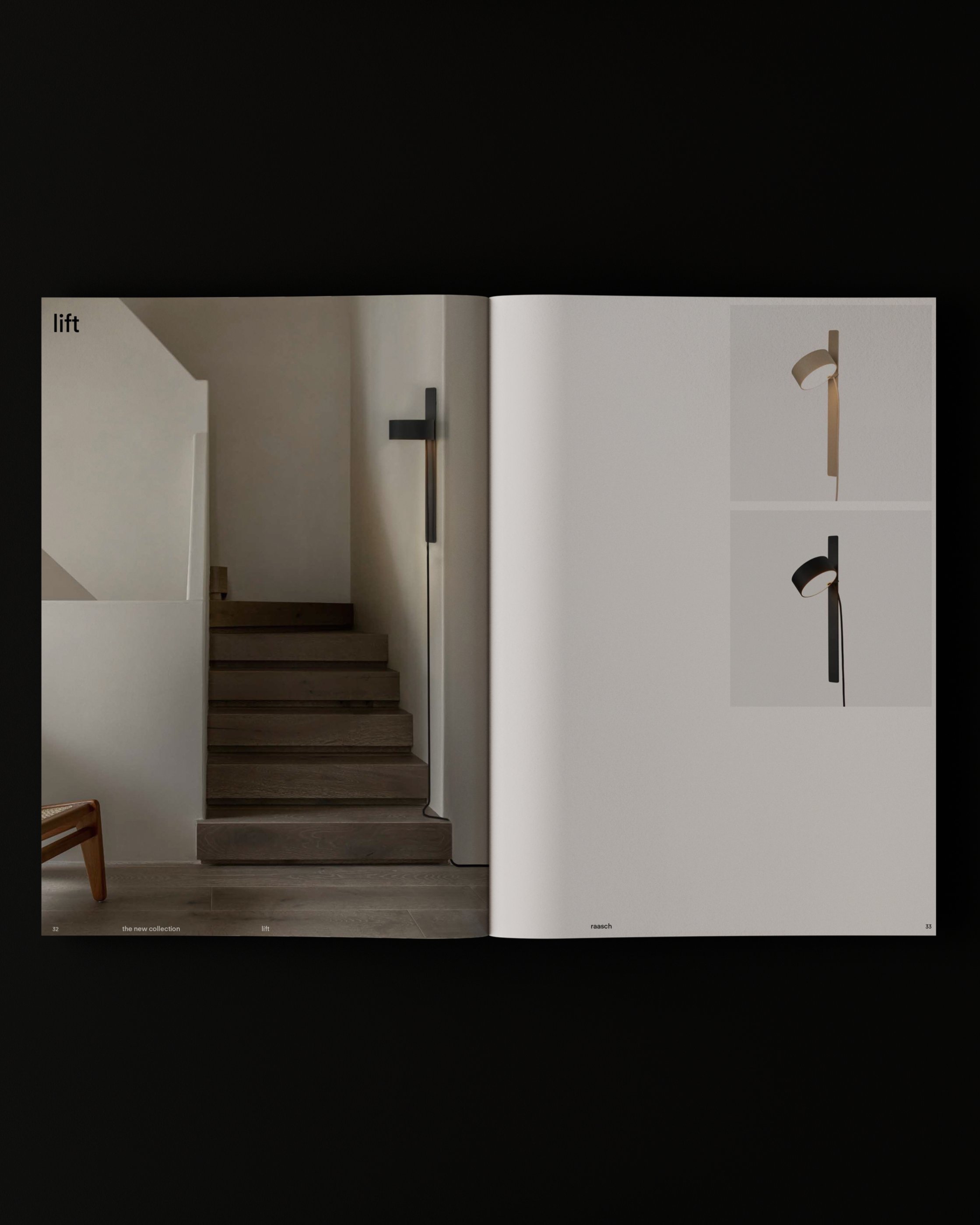
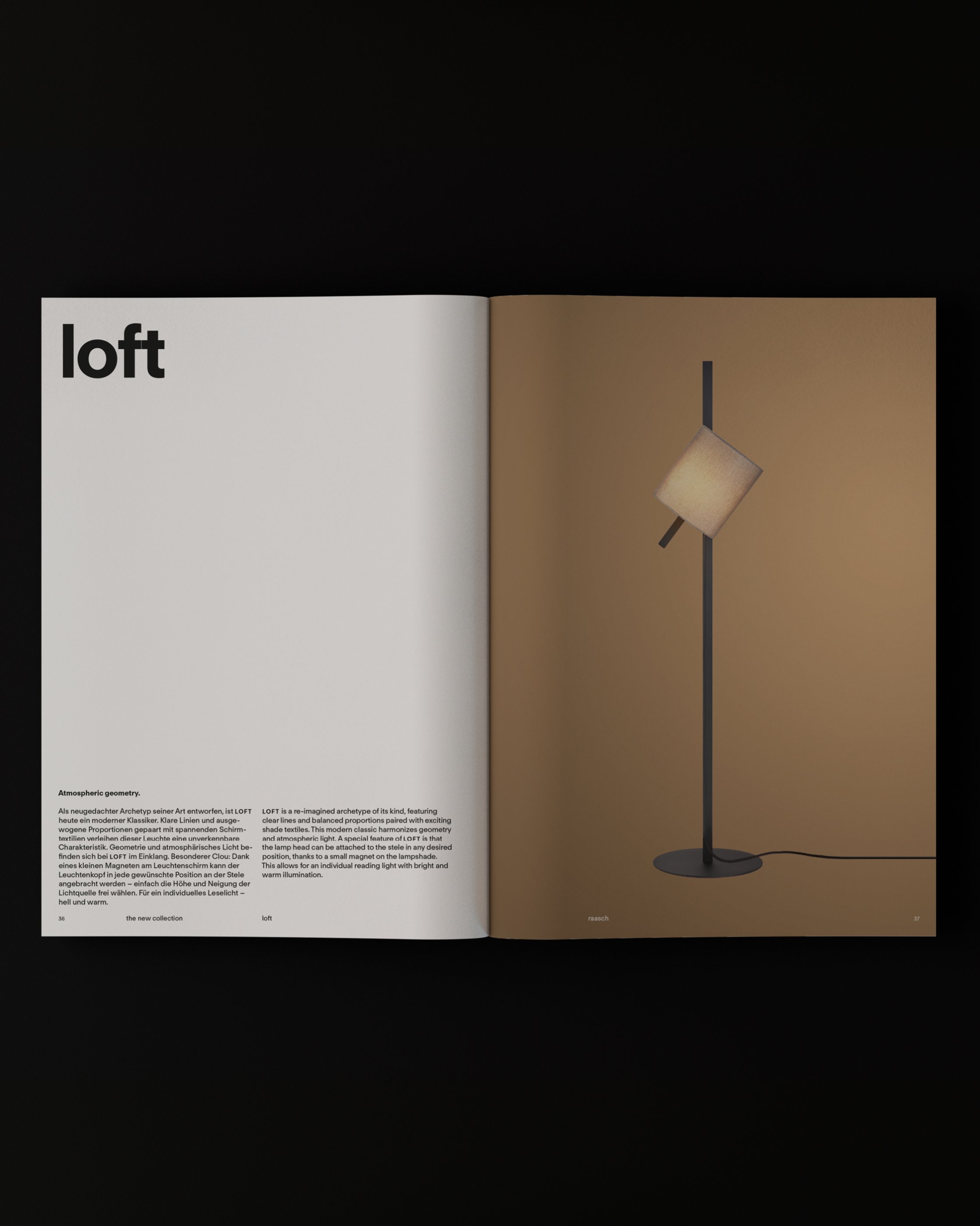
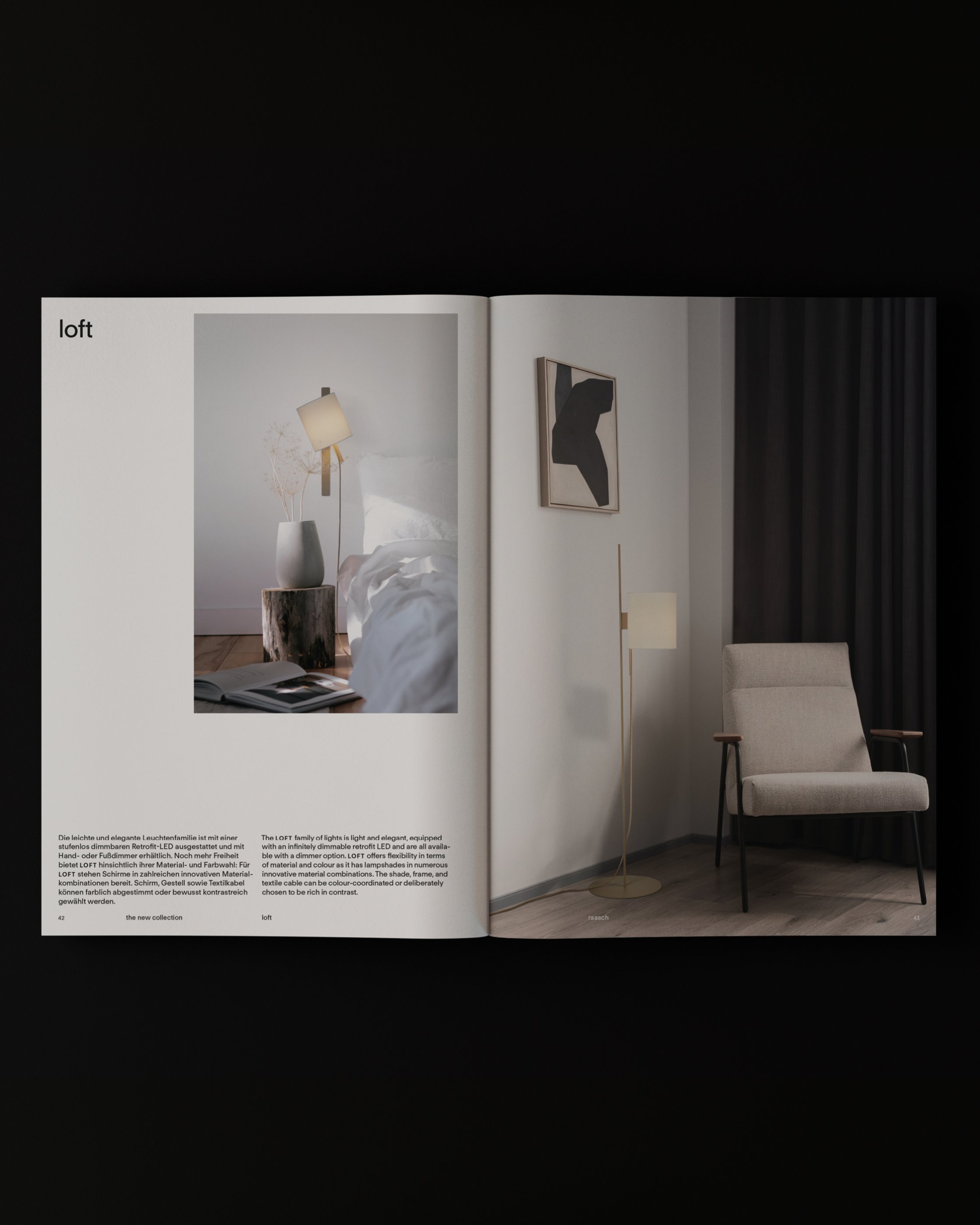
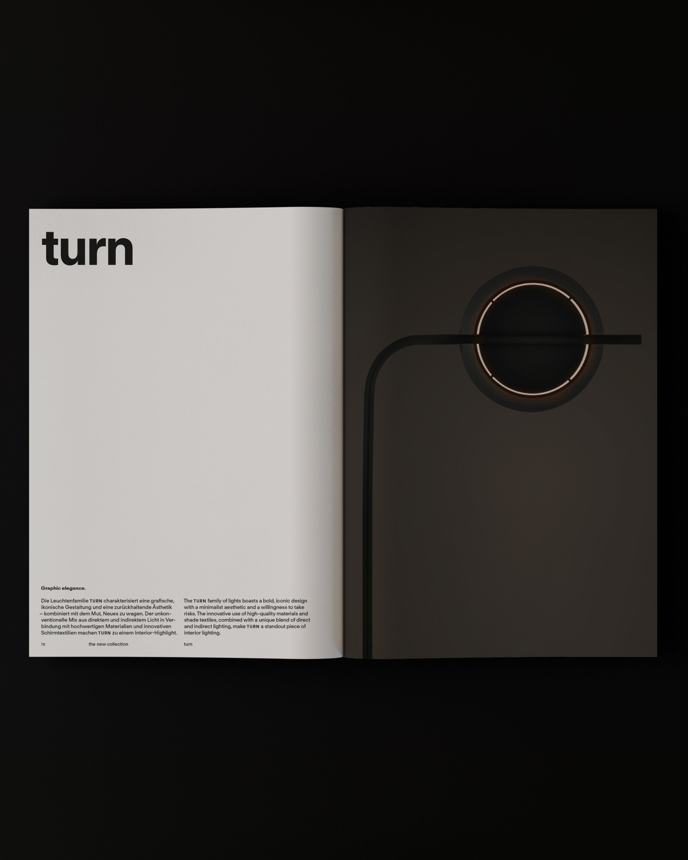
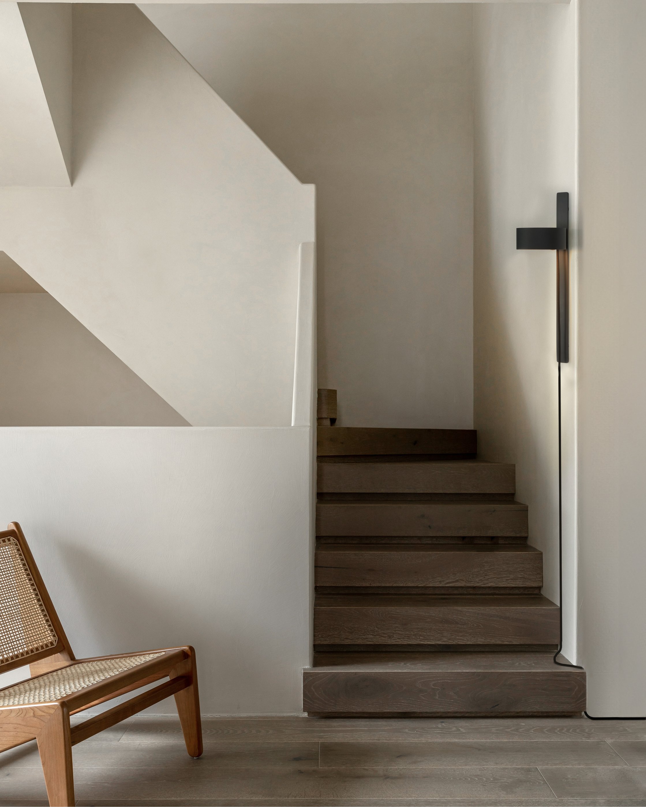
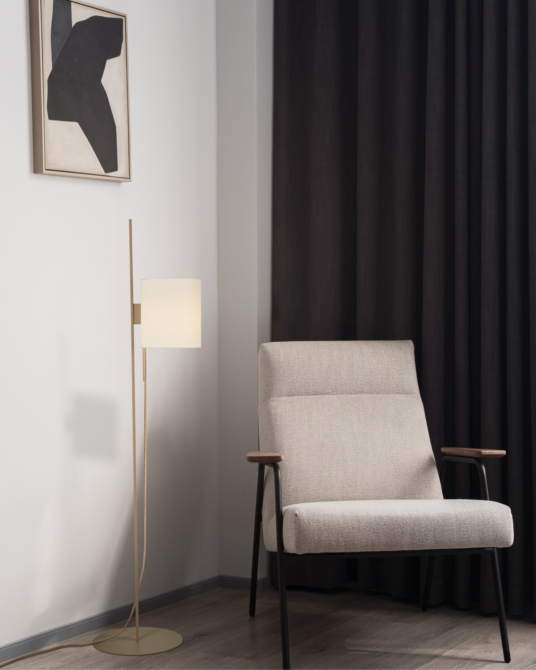
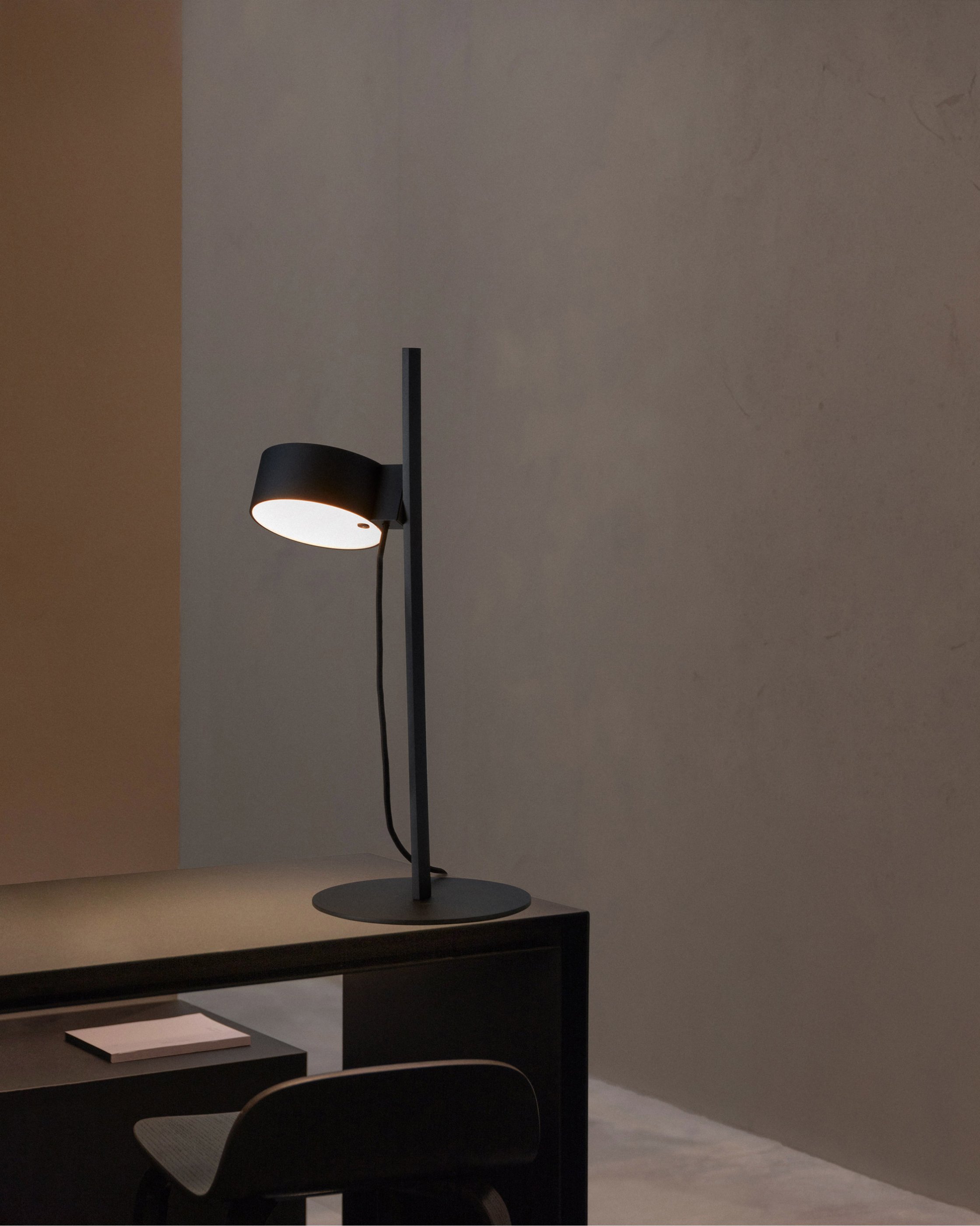
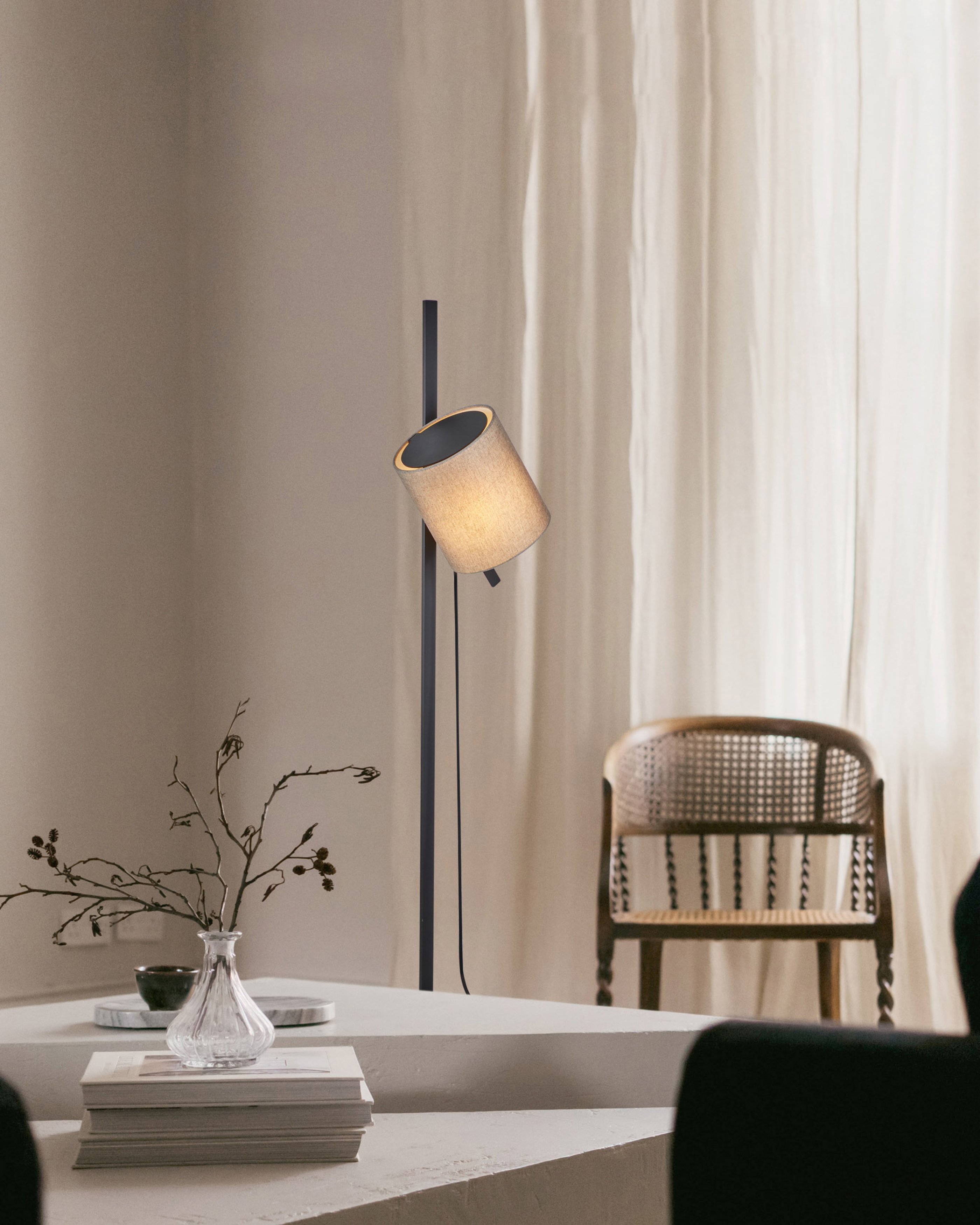
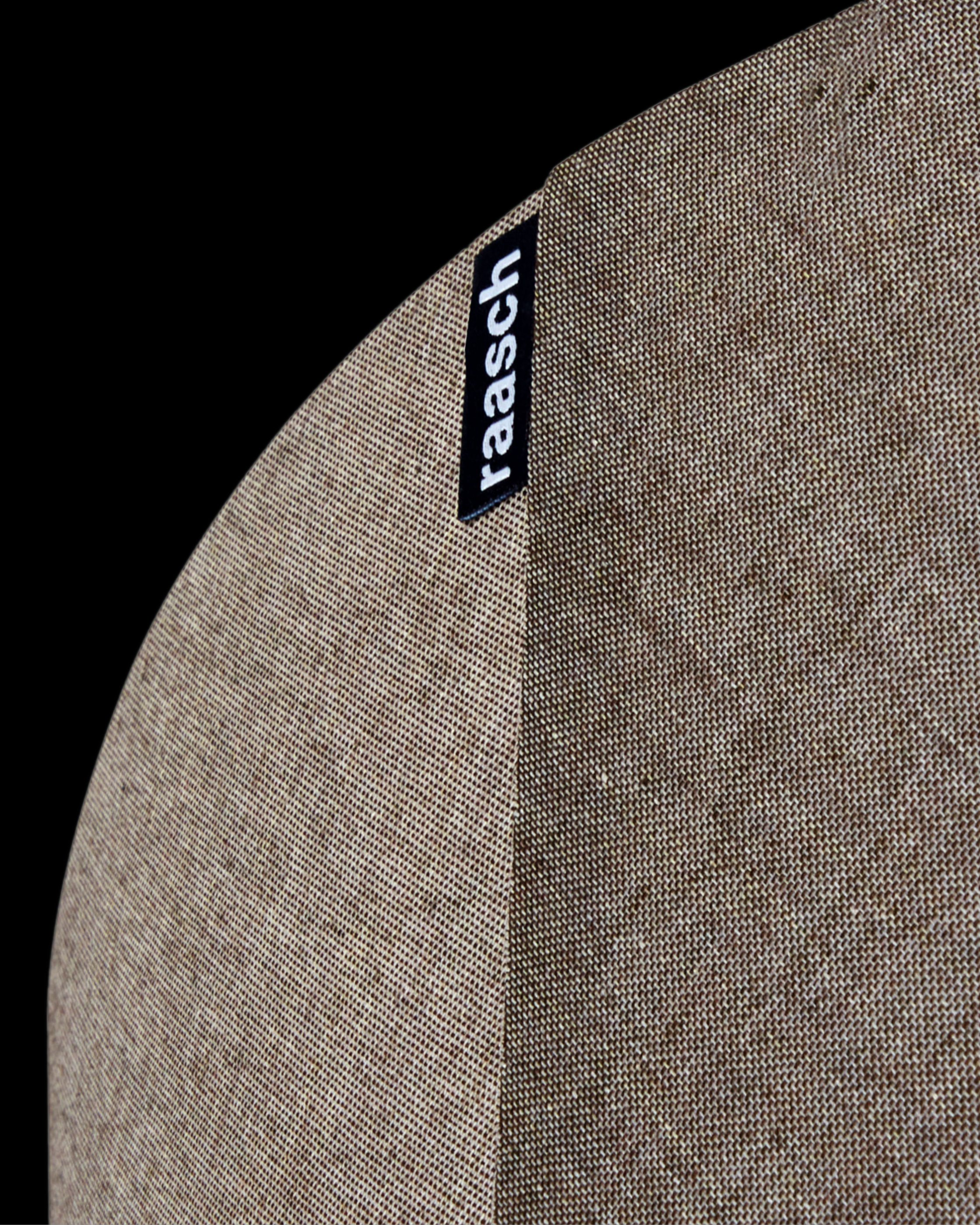
The art direction leans into the many different qualities of light, bringing warmth and approachability to the brand. Complete with a flexible, grid-based layout system spanning static and moving applications and a nuanced colour palette, the visual language is precise, yet organic.
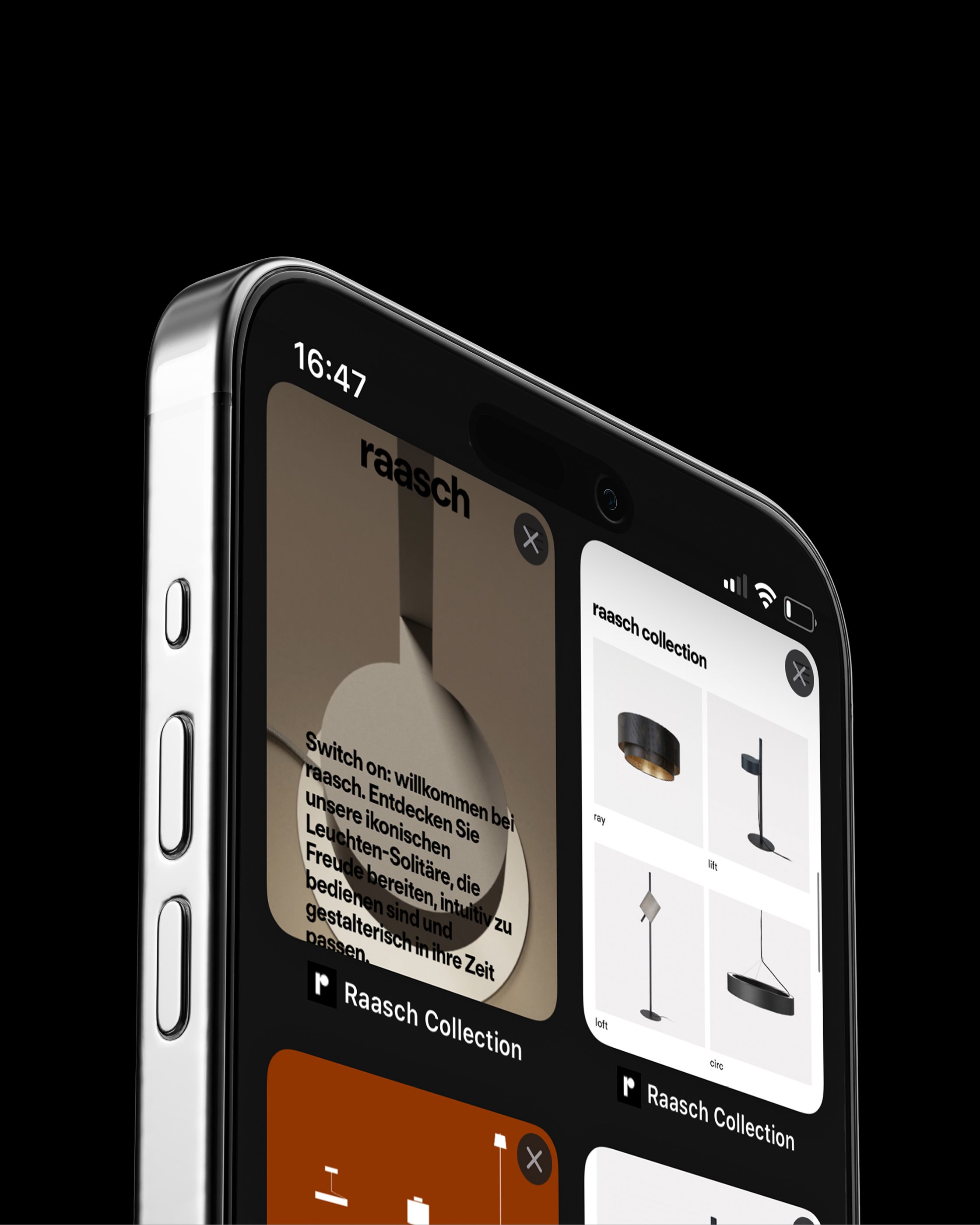
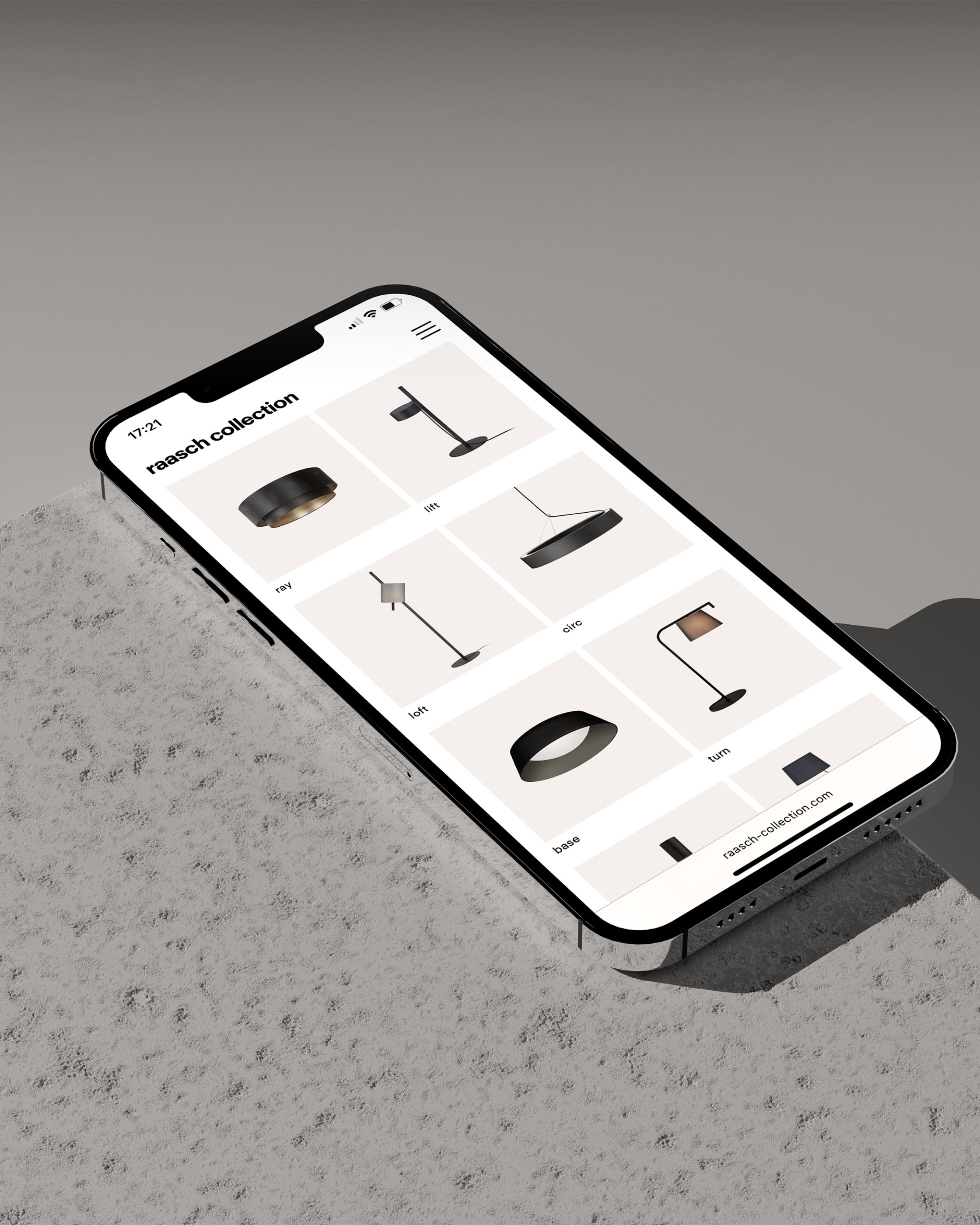
The raasch collection website is designed to be be both informative and captivating, allowing users to browse the raasch products in an environment that reflects the brands formal rigour. Live Site
- Project TeamJonas Zieher, Oliver Häusle
- CopywriterWelcome Design PR
- PhotographyThomas Apel